
06 Feb 2011
Against the Android Action-Bar
 I’ve noticed some interesting UI design patterns emerging in the Android app ecosystem of late. It’s great to see apps evolving to make the best of the mobile platform, but there’s one that irks me. It’s the ‘Action-Bar’ pattern.
A lot of apps on the Android Market seem to be going for this design pattern. Not just small one-man operations, either. Twitter, Aldiko, and even Google’s own IO Conference schedule app all use it. The trouble is, it sucks.
Not So Handy
My dislike for the action-bar stems from the button placement. All the apps mentioned above have the buttons in the action bar on the right (except the Aldiko home button, but that seems to be the exception rather than the rule). This places them next to your thumb, which is really convenient provided you’re holding the device in your right hand.
I hold my phone with my left hand most of the time. When I’m out and about I keep it in my left-hand trouser pocket so naturally when I take it out it ends up in my left hand. Unfortunately for people who do this, the action-bar buttons are in the farthest corner of the screen requiring them to reach across in order to press them. If you have an app that does this, try holding the phone in either hand and try it out to see what I mean.
On The Other Hand
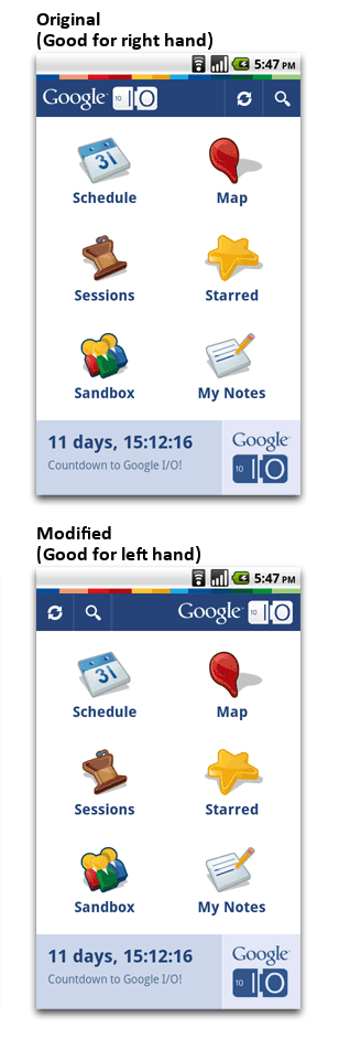 So what’s to be done? My first thought was to move the action-bar to the bottom of the screen. This makes it easier to press the buttons with my left hand, but is terribly cramped when using the right. It basically suffers from the opposite problem as the original.
How about moving the buttons over to the left? Same problem as before, but reversed. I have no idea what the breakdown is between left and right-handedness is when holding a smartphone but either way you end up annoying a large group of people.
Rather than call for the action-bar pattern to be ditched altogether what I’d like to see is app developers taking better care of the needs of their users. A simple check-box in the settings that causes the buttons to be displayed on the left or right accordingly would be great. It’s really easy to do, and would make many apps easier to use for a lot of people.
Thanks for reading! If you like my writing, you may be interested in my book: Healthy Webhook Consumption with Rails
David at 16:37
